I have now got the knowledge of setting up my own photography company. By following the brief I have now produced a fully functioning website, 500 business cards, 3 books and a key ring. I have acknowledged the bases of setting up my own business by researching books in the library that were on the critical readings list and websites that helped me produce the 3 products.
I have built up the skills and knowledge of building a website using Wix. For me the site was quite easy to use for structuring my website how I wanted it to be. I did not want my website to be too technical for viewers, visually I wanted a simple layout that was clear and easy to navigate. I made sure that links were made clear on each page and that writing was visible to read. Critically I researched different sport photographers websites to pick at each aspect that I could include into my website. I noticed from looking at different websites that they all had one image with a simple, clear menu bar that does not distract from the background image. I took this into consideration and included this into my website. I struggled with the aspect of laying out my menu bars at the top of the page as I had a few discussions in tutorials about the layout of the menus and how to layout my images.
I have produced 500 business cards up to professional standard by including information for my email, Facebook, Twitter accounts and mobile number. One visual aspect that I have only just realised that I have not included is my web address. I have made sure that the logo does not clash with the background colour of the cards and that the font is clear and simple to read, I also made sure the information on the back was not cluttered and that they are spaced out evenly. Critically I researched different sport business cards and noticed how cluttered the information was and how they used a sporting image for the background. Visually I thought it was a bit too much and did not want to go down that route of making a business card. I structured my cards in a simple, elegant style that was not too 'in your face' but would stand out when placed into a clients purse/wallet.
My intensions to build a book was not clear at first, but after a discussion in a tutorial, producing a book was another way of filling my work up. In this discussion I was given a suggestion of making a book for my macro images as I have a couple of albums full of them. Visually I struggled with the cover of the macro book. I included many of my images onto the front cover but none of them stood out when paired with the writing. I made sure that the images inside the book suited together on the two pages and did not look out of place or odd. Professionally and visually the cover lets the book down and at the time should have had a tutorial discussion about the problem. As I worried about the timing of producing the book, I went ahead and bought the book to be produced with Blurb. When the product came I was pleased with the outcome and decided to make two more books for my Bristol Flyers photographs and Bristol City U-21's photographs as I thought these two books would be more relevant to the project. I now think the Macro book looks out of place, as my project does not include Macro whatsoever. Visually I should have paid more for better quality of paper as on the images inside the book there is faded white lines going down the images.
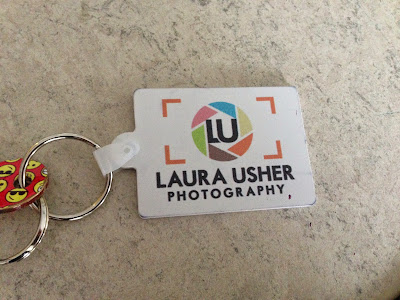
Producing a key ring was a late call for me to produce. I was working my way through my blog and thought that it was looking a bit thin. I started to look around Vista Print as I new they have a quick turn around and spotted key rings. Visually the sporting templates looked a bit cliche and only showed one amount of sport and not a variety as to what I am doing. I decided to go with a plain template, as the white background would make my logo stand out, as it is a very vibrant logo. Professionally and visually this is another way of getting my company out there, out and about around places. By producing these 5 products I have the knowledge and understanding of organising products for my company or another company.
For the exhibition I have enhanced
my confidence by working with a graphic designer from Falmouth University. In
the past couple of weeks I have improved my organisation skills as to organising
the design of the poster and flyer and working with the group to get the design
right. Visually we, the design team, have made sure that everyone in the group
liked each aspect of the poster and the flyer, as it is our exhibition we are
advertising. We listened to all suggestions that the team had to offer to us
and took it all into consideration. Critically we have made sure we have researched
different printing companies to choose which is the best printing site. Jam Jar
was the best company to go for, as they were a local printing shop, which we
could go and pick up our posters and flyers ourselves.


