Friday, 15 May 2015
Exhibition
Planning Printing and Distribution - http://exhibitionfda.blogspot.co.uk/2015/04/planning.html
Logo Planning - http://exhibitionfda.blogspot.co.uk/2015/04/logo-planning.html
Flyer + Poster Designs - http://exhibitionfda.blogspot.co.uk/2015/05/flyer-poster.html
Poster/Flyer Brief - http://exhibitionfda.blogspot.co.uk/2015/05/posterflyer-brief.html

Keyring

In this project I have included a keyring as another way of showing my company 'Laura Usher Photography' when out and about. I can attach it to keys, a bag just to get my company out there. My logo works very well as a keyring as it is vibrant and can catch peoples eye when walking down the street.
On Vista Print, which is where I got my keyring from, there were sport shaped keyrings that I could put my logo on. I did not like those as, like the business cards, I thought they looked a bit cliche and not very good. So I thought I'd go with a simple design and white background to make my logo stand out with its vibrant colours.
Monday, 20 April 2015
Bristol Flyers Book


After receiving my Macro book I decided to produce another one full of my Bristol Flyers images. With this book I have also used a different layout to the Macro book as I had landscape and portrait size images. I have tried to use the layout by not mixing it as it looked like it was all over the place but I have put it into a sequence, for instance, 2 pages - portrait, 1 page - landscape, 2 pages - portrait, 1 page landscape.
Also I wish that I changed the paper quality to a much better one like gloss as the paper that I have chosen for this book has faded lines going down the picture and does not make my images look sharp.
I was not sure on what to put on the front cover as I did try some of my images on the front but none of them looked right. So I chose to stick with one simple colour and a colour that represents the team, which is Red.
The purpose of this book is just another way of showing my images to a client. If for some reason there is a technical error on my website or another reason that I or the client can not get on it I can have this book for back up.
Bristol City U-21's Book


After receiving my Macro book I decided to make one for my Bristol City U-21's photos as well. The book came out really well but I should of payed extra for better paper quality as the paper that I have chosen has got faded lines going down it and does not make my images look sharp. I have also changed the layout compared to the Macro book. As I have a few portrait size images I have tried to mix it up a bit. With my portrait images I have used a layout where the image is on the right hand side of the page on its own. I did not like the style of two portraiture images together as it looks a bit too clustered, so by using the right hand side style it looks more elegant and simple.
I was also not sure on what to put on the front cover. I did try using some of my images to put on the front but none of them looked right so I chose a plain and simple colour and a colour that represents the team, which is Red.
The purpose of this book is just another way of showing my images to a client. If for some reason there is a technical error on my website or another reason that I or the client can not get on it I can have this book for back up.
Tuesday, 14 April 2015
Macro Book
I had a tutorial with my tutors and they suggested in me making a book for some of my Macro images. So I went through all my Macro images and picked out the best ones. I chose to produce my book with Blurb as I have ordered a book from them before and they are really good. I struggled with the cover of the book as none of my images looked very good. So I chose to stick with one colour but choosing that one colour was a struggle as well. In the end I went for the colour green as the colour went with my images.
Soft Cover, 20 Pages = £24.02
Below is how the book turned out


Tuesday, 3 March 2015
Magazine Research
Runners World
Editor: Andy Dixon. Art Editor: Russell Fairbrother.
"Monthly publication for running enthusiasts."

Well Red


The Freelance Photographers Market Handbook
Published - Great Britain
By BFP books
Bureau of Freelance Photographers, 2010
27th Addition
Boxing Monthly - P. 114
Editor: Glyn Leach
"Heavily illustrated publication for boxing enthusiasts, covering both professional and amateur boxing."

Cover

Cover

Inside
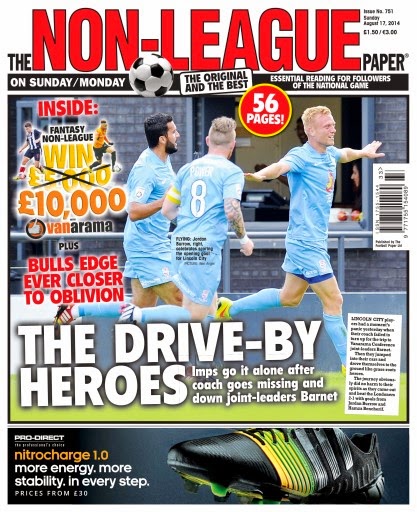
The Non - League Paper
Editor: David Emery. News Editor: John Lyons. Picture Editor: Sam Emery
"Weekly tabloid covering the non - League soccer scene, published every Sunday.
Cover

Cover


Inside
Rugby World
Editor: Paul Morgan. Art Editor: Kevin Eason.
"Britain's biggest selling monthly rugby magazine giving general coverage of Rugby Union."

Cover

Cover

Cycling Plus
Editor: Rob Spedding. Art/Picture Editor: Warren Rossiter.
"Monthly magazine aimed at recreational cyclists, concentrating on touring and leisure/fitness riding. Some racing coverage."

Cover

Cover
http://www.bikeradar.com/news/article/cycling-plus-magazine-celebrates-the-success-of-team-gb-18292/
Monday, 2 March 2015
Magazine
Cover Page

Front cover - background

Front cover - added text

Front cover - added barcode

Front cover - changed layout of text

Front cover - changed text effect
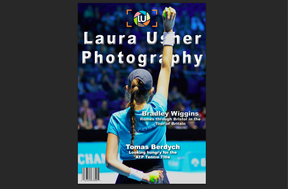
Front cover - changed logo and title text, kerning/spacing
https://www.youtube.com/watch?v=kVFs6eyCbvU


This is the first page of my magazine, the contents page. I found it hard to figure out where to place the writing and finding the right image to go as the background. I am still not that pleased with this image as my background but it is the only one that fits with the writing.
This is the second page for my magazine. This image connects with the background image on the first page. I think it works really well using one image for both pages.
Third Page
I struggled to come up with a colour for the background. I did not want a bright colour as I thought it would be too bright for the reader but also not a dark colour to make the page look dull. However I chose grey for my background as you can see on the forth page i have used an image of myself which is in black and white. The only colour that i could use for the background and to match the image is grey so I chose to us that colour.
Forth Page
Fifth Page
For the Bristol Flyers page my first thought was to use this image as my background as it really stands out with the drama of the player trying to reach for the ball. Also I could fit the text in nicely at the bottom left of the page, tucked underneath the player.
Sixth Page
With this page I studied other sports magazines closely and I noticed that they photoshop the player and stick it on a plain background so the reader focuses on the action of the player. So I tried it myself and this is the outcome of the page. The position of the player really helps when controlling the text around the player.
Seventh Page
With this page I have used the similar technique that I used on the first and second page of using on image that has spread out onto two pages. This page is specifically for the Bristol City U-21's team that I went and photographed a few weeks ago. When I started working on this page I new that image for the background would work as I caught the action of the player kicking the ball and space on the right side of the image for text on page eight as shown below.
Eighth Page
Ninth Page
When I started this page I new I wanted to use a map to show the trail of the stage going from Worcester to Bristol. So I used google maps to find the trail and highlighted to show the trail. I struggled to find the right colour for the background. I went for a cream colour which went well with the image i have used for the tenth page, as seen below, but clashed with the map on the right. So I added a drop shadow for the map to stand out and also gives it a bit of depth from the map below. Choosing the colour for the writing was hard too as I couldn't find a colour that matched the images or the background. In the end I found that red was the right colour as it went with the red trial that I used for the images.
Tenth Page
Eleventh Page
The image in the background works really well as it shows the tension of the player. By using this image there was only one position I could place the writing.
Twelfth Image
The background image works really well with the title as I have placed the bouncing ball where the O is in the word world. It works really well as the colours go together nicely and it gives the page a boost from previous pages.
I have not carried on in producing a magazine as to actually print a magazine you have to have over 20 pages for a supplier to print. I have produced 12 pages but can not think of any ideas of how to increase pages.
I did come up with an idea of coming up with a games page as shown in the Bristol City Well Red magazine but can only come up with producing a word search. Also trying to produce a word search is hard as I can not find a system that produces grids.
I have also thought about making the last few pages as a gallery of a few of my images taking over the events, but I don't think it will work as it will be just images placed at the back of a magazine.
Subscribe to:
Posts (Atom)