Choosing a template - Portfolio Site
Template preview
I chose this template as it is simple and I like the layout of the menus at the top. The menu bars are see-through which enables more of the background image to be shown to highlight the picture.
Changing background image
Background image changed
Changing the font
Website font changed
Adding a logo
The logo goes very well with the website as the background image is black and white and makes the logo stand out.
Logo added to page
Linked logo to Home page
I have linked the logo to the home page as this makes it easier for visitors to go back to the main page.
Adding a contact page
Connecting to other sites on the contact page
Adding web links to home page
Putting in details for the contact page
Changed style of the contact page
Adding a gallery page
Added the Bristol City page to the gallery
Adding albums to the gallery menu gives a neater appearance as I did not want the top bar getting cluttered with different albums.
The gallery now includes a drop-down menu to the Bristol City album
Selecting gallery style - Grid
Changing the background image to black and white. I included the coloured book version of the image as I found there was too much black and white overall.
Changed the menu font colour to white as the previous colour (grey) was blending in with the background and was hard to see - My Blue Sneakers
Changing the contact page layout
Added a new page called ATP Tennis 2013 and have included the images in that gallery.
Adding Tour of Britain page and images into the gallery.
Got rid of watermark in the bottom right hand corner - As said in tutorial.
Got rid of the name of the designer who designed the template in the bottom left hand corner.
Changing copyright information.
In the first image I have shown that I have kept the same image but in all black and white, I have changed the colour of the font and moved the titles along as the writing blended in with the black in the background image. The colour of the writing also goes with the background colour on the other pages.
In the second image I have changed the background from one of my images to a plain colour as in a tutorial discussion my tutors suggested to get rid of the image in the background and use a simple colour as the images in the galleries can clash with an image as my background.
Added Portfolio Page
In my last tutorial my tutor suggested in adding a portfolio page as we have to make our portfolio for our professional development project. I have added 30 images on the page as I am thinking of showing my images in a show box which contains up to 15 images. So I am going to have one box with 15 images of my sports photography and another box with 15 images from previous University work and macro photography.
I have now written in my About Me page. I struggled in what to say and what to include and what not to include.
On the contact page I have got rid of my phone number, email address and house address as in a peer group review session a class mate suggested to take those information off as I might get random/dodgy people calling or sending letters to me.
I have now upgraded my website as in a tutorial with my tutor Emilie we discussed getting rid of the Wix advertising banners as it is distracting and does not look very professional.
So I have chosen the £5.16 package that I have highlighted in the image above.
This Includes:
Bigger Storage - 10GB
Connect Domain Name
Google Analytics
Premium Support
Free Hosting
Remove Wix Ads
Get a Free Domain
No Mobile Ads
Customised Favicon
Google AdWords Voucher - $75
Changed Gallery page to Sport Page as suggested by my class. They also suggested to bundle some of my sports images together instead of having a drop down menu.
I have now added a Macro page suggested by my tutor. As I have a lot of Macro images, she suggested to show them off on the website as now my website shows that my main areas of photography that I focus on is Sport and Macro photography.
I have added 4 of my projects on to my website as suggested by my tutor. I have also added descriptions to each project to make the reader understand what were the projects for and how I came across them.
As I have now sorted out my portfolio I have included my images into the Portfolio page.
Phone
Home Page
About Page
Gallery - Bristol City Page
The gallery page looks very professional. I used the grid style for presenting my images on a mobile device such as iPhone and Android phones.
Contact Page
I have tried to make the contact page very simple to use and that it was laid out neatly.
After Upgrade
Front Page
I have got rid of the Wix banner that was at the top of the page
About Me Page
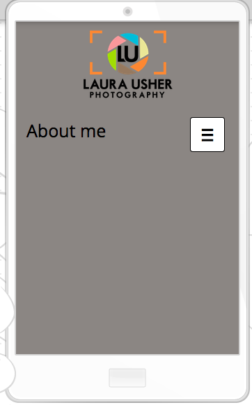
I have got rid of the Wix banner but for some reason the writing will not show up in mobile display. On a normal computer or tablet the writing shows up but not on a mobile device. Also I have changed the background to a grey colour instead of one of my images that I still use for the front page.
Gallery Page
I got rid of the Wix banner at the top of the page and also changed the colour of the background to grey instead of one of my images.
Included a Portfolio page suggested by my tutor
Contact Page
Got rid of Email address, House address and Mobile number as suggested by my class in peer group review
Switching Domain Name
Switching Domain Name from Wordpress to Wix
Log into namecheap.com, Select manage domains, Scroll through to find laurausherphotography.com
On the left select URL Forwarding
In both boxes put the Wix URL, Change record type to URL Redirect, Click on save and then wait a few hours for it to change.